In Cyclops, we offer high flexibility for you to view the data. Below are the ways to view your data:
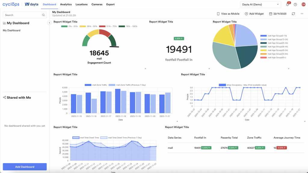
Widget allows you to build your own dashboard with different layouts, refer to this article to see how.
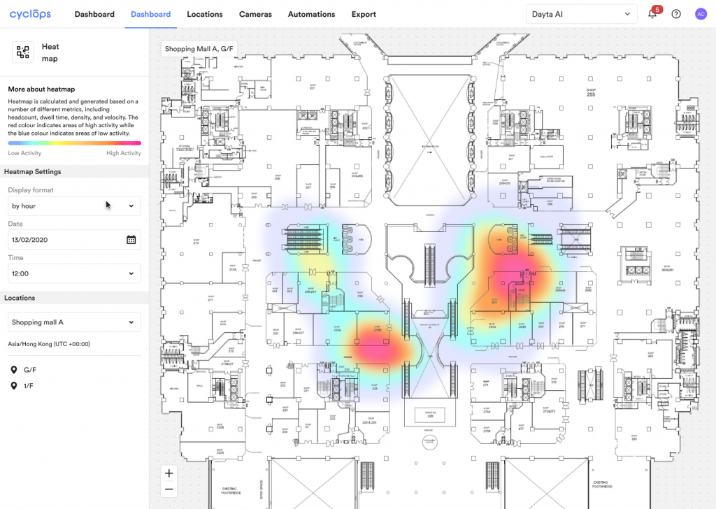
Heatmap is useful to understand the hot & cold zones of your store, affecting how you are planning out the marketing campaign. Refer to this article for more information.
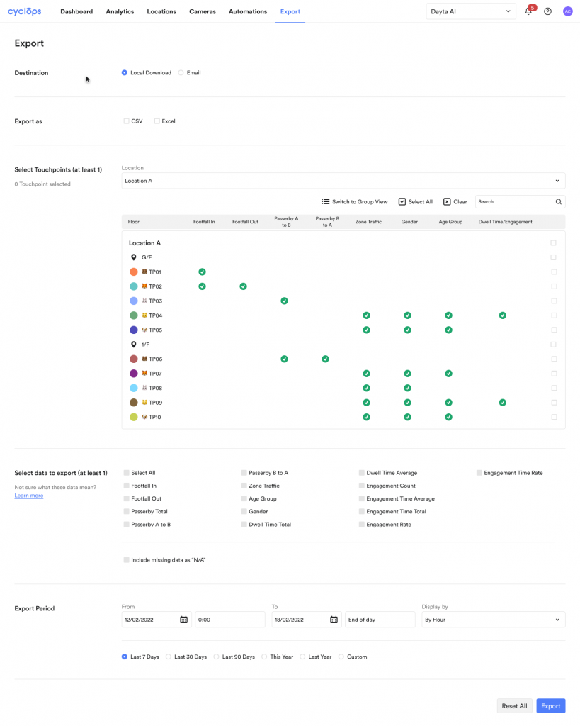
The Export tab allows you to export your data in Excel or CSV in customised combinations. Refer to this article for more information.
Related Questions: